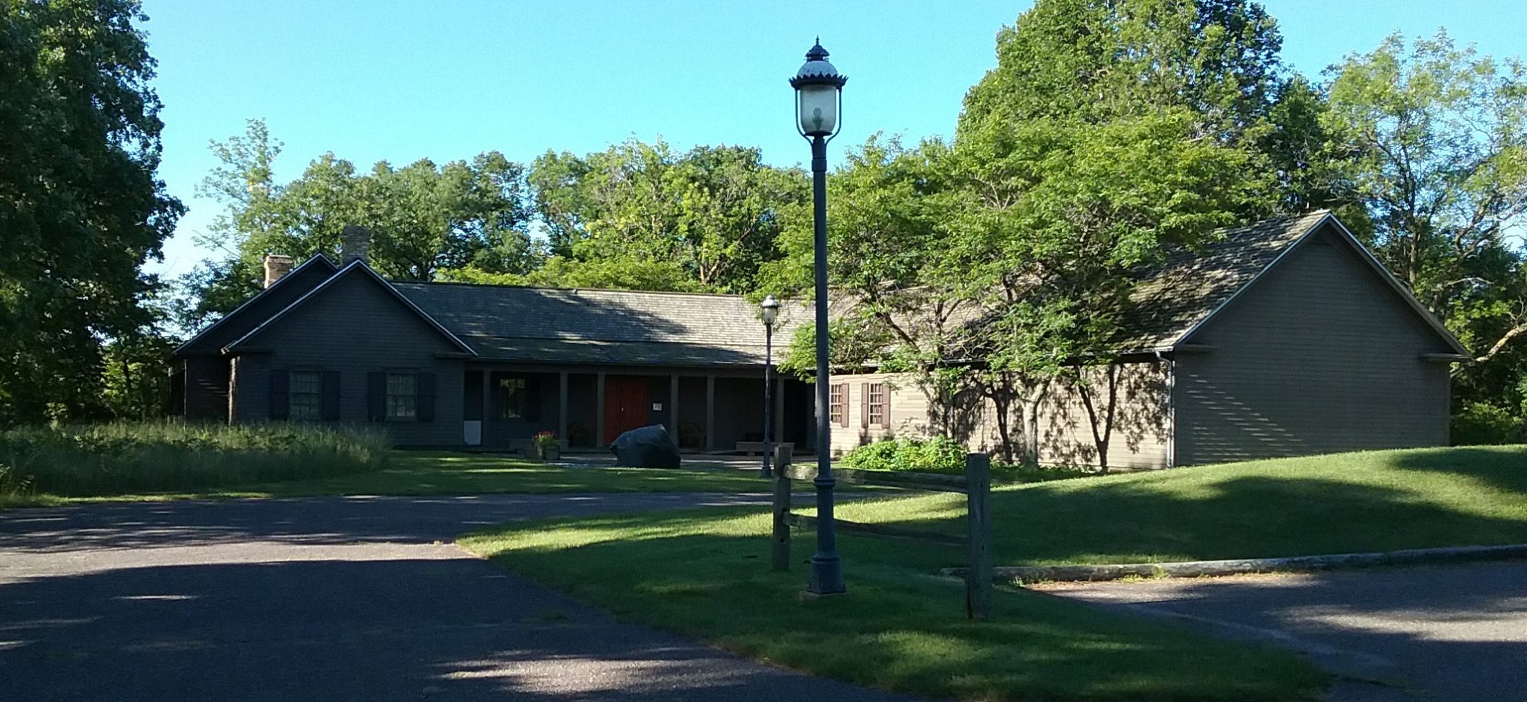
As you can probably tell if you’re a regular visitor to the MCHS website, our site has undergone a makeover. It’s been two years (already?!?) since we updated our site, making it WordPress-based so we could incorporate our blog on the front page. We felt it was time for a new, more dramatic look.
Our site is still in two sections, the Main or Home section, which you are now on, and the History section. You can get to the History section by clicking on the History button below in the left sidebar. When you’re on the History section, you’ll see a different header photo that is actually labeled “History.” We’re not sure if the two sections caused any confusion before because each section had its own color scheme (green for Home and blue for History), but we want to forestall any possible confusion this time.
Let us know what you think about the new design.
